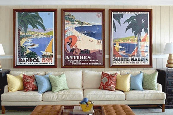
Creating a poster begins with a standard canvas. A4 (8.5 by 11 inches), 11 by 17 inches, and 22 by 34 inches are typical poster sizes. Typical large format poster dimensions are 24 by 36 inches.
Although posters can be created with a vertical or horizontal orientation, the former is more usual. Today, we’ll look at 3 easy tips for making your next poster design better. Let’s get started with the poster design tips right away just like you can get on vista create.

Make it easy to read and create a mini design before final touch
A poster’s primary goal is often to draw attention to an event. To bring attention to the poster and establish a hierarchy in the text, the most important information should be simple to read from a distance. You can think of text as having three separate layers when it comes to poster design.
- Headline: The design’s primary text element is this one. Either in place of or in addition to an artistic component. Choose a typeface that is readable, intriguing, and attention-grabbing.
- Details: In the text’s second level, respond to these questions. What details are required for someone to fulfill the request on your poster? Give the details in a clear and straightforward manner. There are two alternatives for size: either use a larger size and another contrast method, or reduce the size to around half of the main headline for a very apparent hierarchy.
- Fine print: It’s anything else that someone determined required to be on the poster, which is frequently seen on movie posters. Make it compact and place it away from traffic.
Despite the fact that designing posters is primarily a print activity, make smaller versions that may be applied elsewhere as well. One of the fundamental rules of marketing is that something needs to be presented to a person 20 times before they remember it. You can do exactly that with the help of the various poster variations.
Related
5 Ways to Spruce up Your Bedroom and Improve Quality Sleep
10 Amazing Ideas to Enhance Your Interior Exposed Brick Wall
Make use of high contrast and leave a strong CTA
A poster only has one chance to catch someone’s eye. High contrast between pieces might assist you in accomplishing that. Go aggressive with color and type choices instead of sticking to a monochromatic color scheme with subtle gradients.
A typeface or color scheme that could be deemed too wild for other projects is a fantastic candidate for poster design. Play around with it.
Consider a background with a lot of colors as well. Designers of posters frequently begin with a blank canvas. To make your poster stand out from the competition, if your printer supports it, utilize a rich color backdrop with a complete bleed.
Every poster’s objective is to make people aware of something. The majority of these touches include extending an invitation to an event, such a movie, concert, or other gathering.
A call to action is essential in light of this. Give it a high amount of prominence in the design, just like you would if you were creating a call to action for a website or app.
Consider Size and Location
This is crucial: Where will your poster be displayed? This depends on a number of things, such as the poster’s size and aspect ratio, the visual clutter in the area, and whether or not the audience will find your call to action persuasive.
Making decisions about the design’s creation can be aided by knowing where it will be used. Visual contrast is a crucial external component as well as an important internal component of your design.
Consider it like this: You should generally choose contrasting colors for your poster if it will be displayed on a green wall to prevent the artwork from blending in with the surroundings.
